Effectively harnessing Motion Design for GenZs
"Good design is obvious, great design is transparent"
It's a Joe Sparano line which you find yourself quoting in your first year of design school, first day at work or even as someone who has worked on visual design for many years. The line continues to find application across design fields and definitely in Motion design - what this piece is gong to focus on.
Hello there. This is Hrishi - Motion designer and Video editor at FamPay. I, along with the creative team - produce all things visual at FamPay. My specific domain is Motion design - covering everything from social media videos, logo animation, insta filters, promo videos to in-app animations.
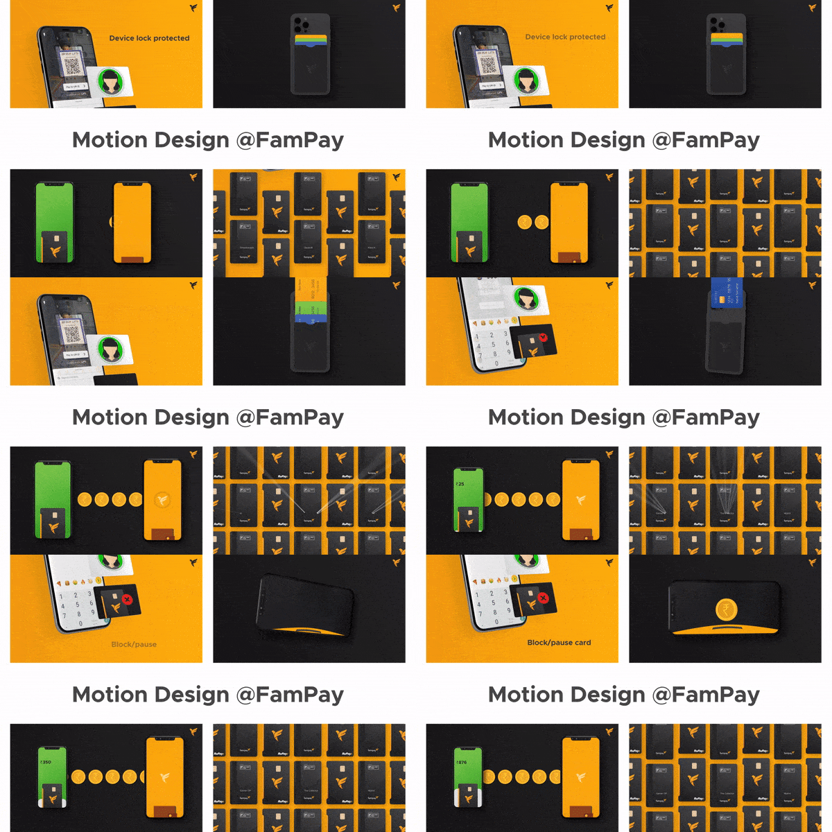
When one sits down to write 'A Guide to.." it forces you to reflect on your own work process - analyze the workflows, appreciate smaller things and even question some decisions. As most of us are constantly and single mindedly hurtling towards completing deadlines, sitting back and reflecting is a great and rare opportunity to look at what works, what doesn't - and most importantly what has the maximum effort-to-impact ratio.
The point of any motion design exercise is to convey the most with the least amount of words - something I plan to stick to with this piece as well.
Does it need to be a video? 🤔
1 frame or 24 frames?
A video should never be a crutch to your inability to simplifying an idea. It actually helps looking at the very meaning of a video - images moving at 24fps. It resets how you think of a video versus a static creative - video has an added dimension of time. Only ideas that need the element of time should get the 24fps treatment. Since videos by their nature are more work intensive - it becomes all the more important for a start-up to choose and allocate resources accordingly. Sometimes even effective composition and font hierarchy helps create a sense of time within a frame. Like the popular design post -
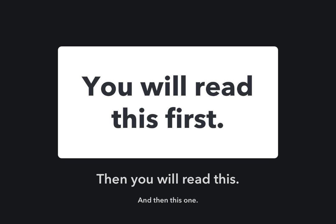
The above is nothing more than evoking a sense of time within a static post. So always remember to ask yourself (or more often your copywriting team) - "Ehm, does this need to be a video?"
Tell a story
The oldest tool in shed is still the best one.
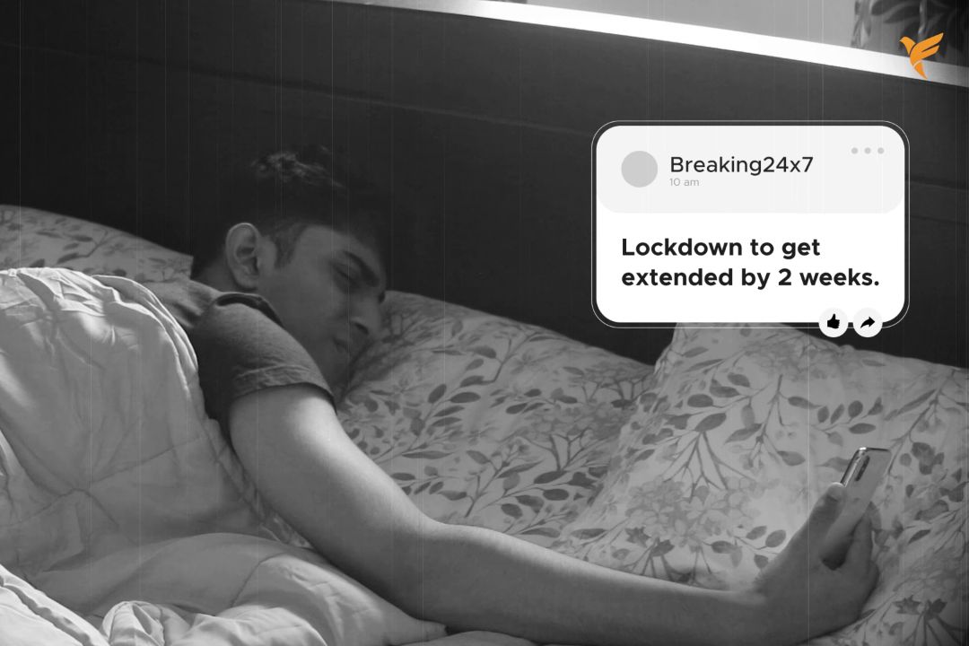
Let's say the brief very well needs to be a video. In the age of teasers, pre-teasers, teaser to pre-teaser, motion teaser to pre..... two things are clear - teens are extremely online but extremely fickle with their attention spans. You get a very short amount time to grab attention - not a unique observation by any stretch. But the key is again at the core of why the moving images came into being - storytelling.

A story has chapters, movie has acts - similarly a video needs to have an opening, a middle and an end. For the GenZs it helps to think of the video as less a movie script but a stand up piece. You need to have a set-up and a punch line - the most effective way of telling an interesting story.
Hack #1 The Sticker Repository

Create a set of animated instagram stickers and GIFs. This helps in multiple ways - for use directly on insta stories alongside native text for fast execution as well as to create a repository of visuals that can be quickly used to add zing to videos. The stickers also double up as elements that the target audience can use ensuring a secondary promotion channel. For instance a card swipe loop animation can be quickly added to an insta story about the Famcard while also being used as visual element in videos.
Adapt - to the brief and to the world
The one thing 2020 has taught us.....
2020 made us rewrite the rules and adapt rapidly to the changing world around us. From bigger things like company structures - to much smaller things like daily workflows - everything has gone through a transformation. So why won't video production.
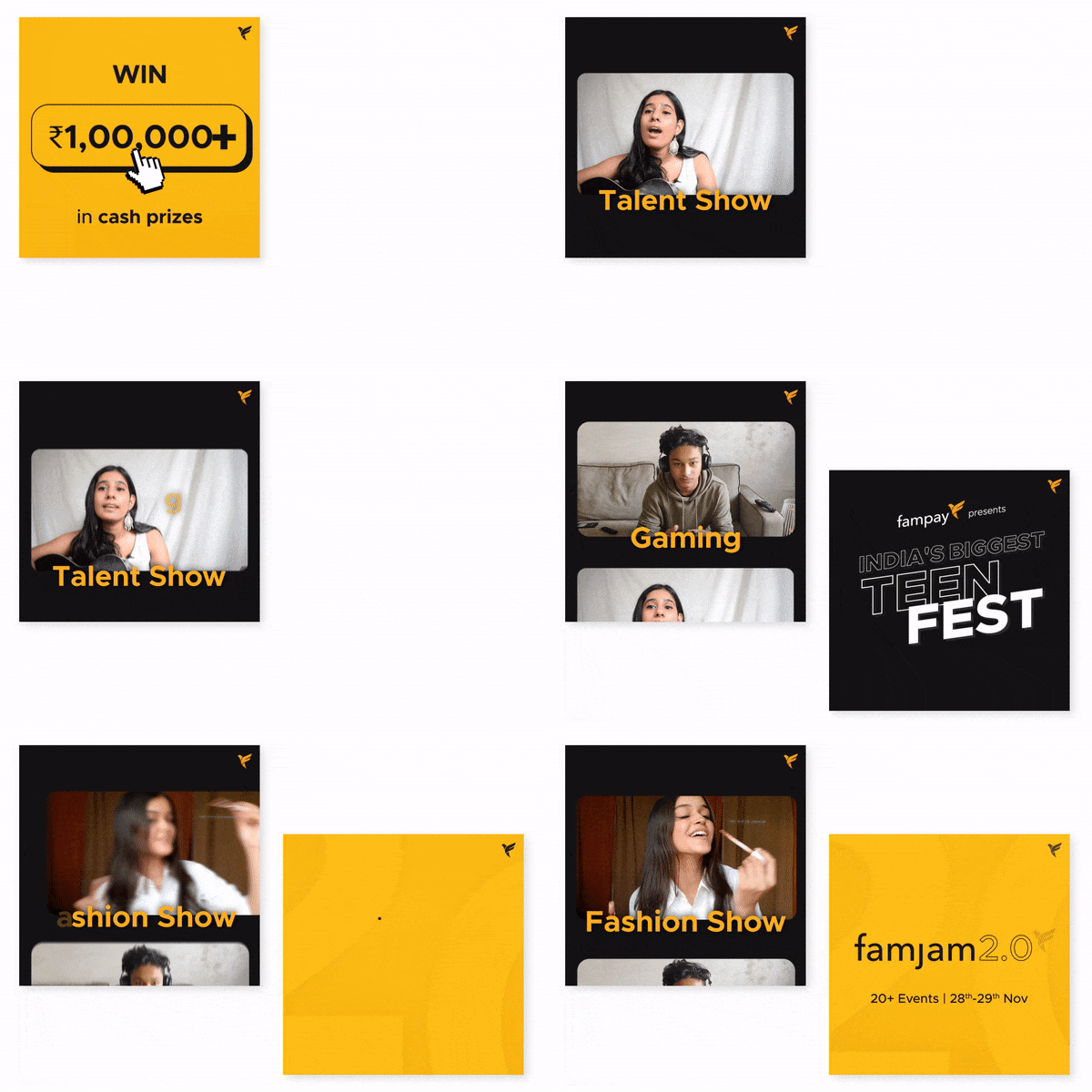
During conceptualization, the video needs to adapt both to the design brief and available video tools. It is vital not to be constrained by production limitations. The above video was completely made from user submitted videos and motion graphics instead of limiting the brief due to lack of access to live production in the pandemic. Also all live video production is now replaced by zoom calls and the video design has changed with it. It's important to move seamlessly in and out of footage, animated typography, 2D animation, 3D elements, etc to create a complete mixed media package.
Gen Who?
Longer and descriptive? Short and punchy?
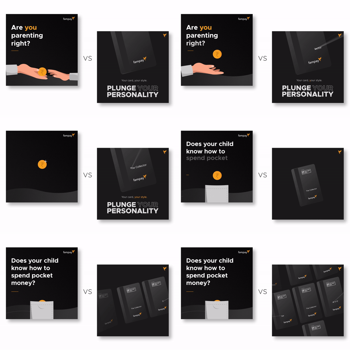
Despite being a GenZ brand, it is very important for FamPay to target the GenX as well - as they form an integral part of the sign up process and the permission structure in Indian homes. This creates the need to also think of the various kinds of media consumed by the GenX and concurrently create video content that's more suited to them. Broadly, slightly longer attention spans, easy-to-forward, bulleted points along with a general lack of frills are important pillars of cracking the ideal GenX video.
Pick the right tools and format
Square, AE, 3D
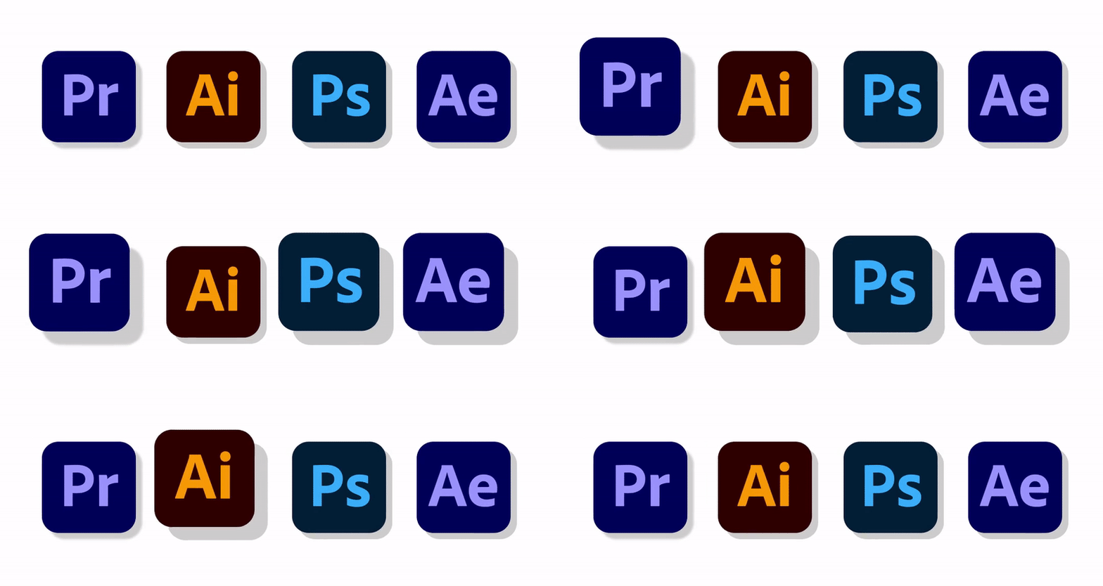
Its important to get three things right - What format to pick (portrait/landscape/square), which tools to use (After Effects/Premiere Pro/etc) and which medium to use (2D animation/3D space). These essentially are the 3 ingredients of efficient production. Incorrect format can be an issue if the same visual need to adapted to a different channel. For instance, converting a landscape video to portrait version is the most thankless (and useless) task in the world. Similarly incorrect software choice can hamper the ability to make said edits.
When in doubt - Pick square, AE and keep the space 3D.
Hack #2 Get that mask on
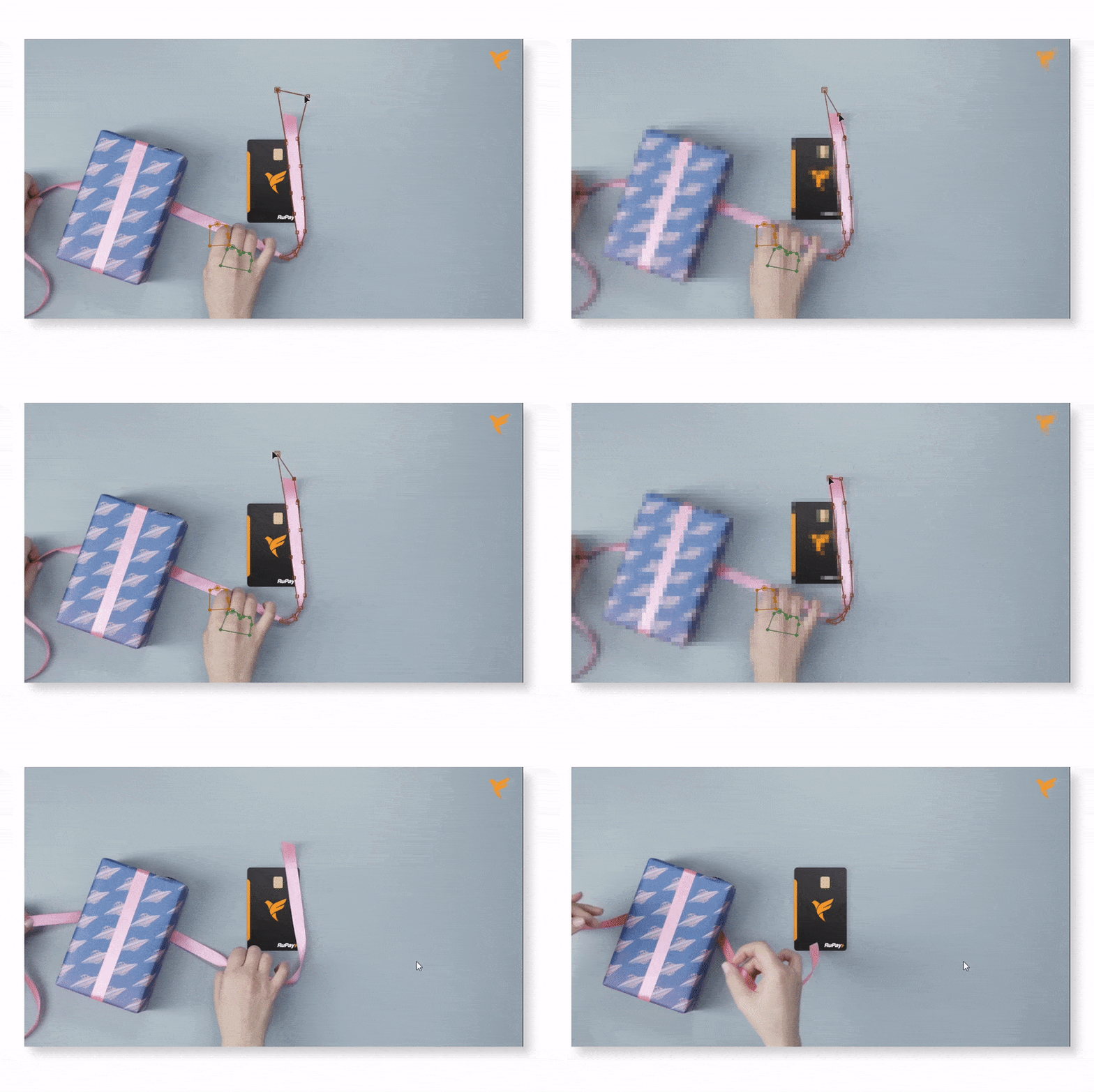
Masking (Rotoscoping) can be inconvenient but extremely essential - IRL and while editing. Layer masking gets bad press being a time consuming process - when used judiciously and correctly, it can give some really cool results.
Keyframe, Keyframe, Keyframe
If you ever complained in your Physics class -"When will I ever use these damn graphs" it was for this damn day.
They say Typographers throw a fit when they see text with bad kerning. If I had to pick one element that has a similar effect on a Motion Designer -its the lack of keyframing and easing.
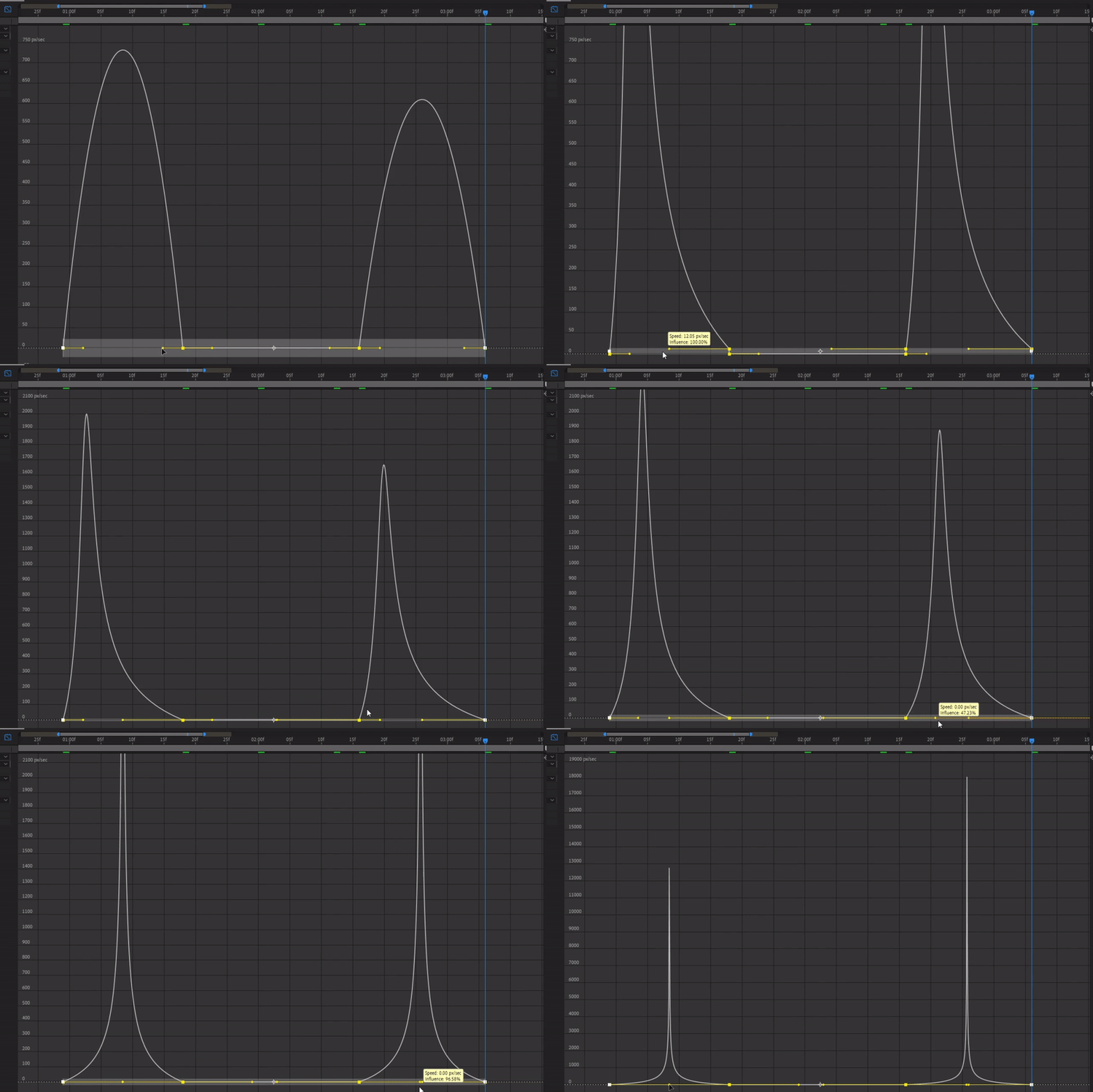
The biggest difference between an amateur and pro video isn't colours, illustration quality or even transitions used - but simply, the rate of change of motion. Most editors start their journey through free mobile apps or Premiere Pro - that prioritize drag-and-drop transitions and ease of editing over keyframing. However the key to great Motion Design will always be how you tweak the keyframes. Does the Card start slow and then speed up, or does it begin at a high speed and then gently come to rest - it makes all the difference when it comes to videos with lots of motion design.
It's impossible to do both - state how important this is (and more than just a hack, which it could have been) and to explain in detail in a short paragraph. Just know this - choose the L,I and J graphs wisely.
Take a note from - The Movies
Watching movies is hard work.
Something to keep in mind while crafting videos is to always keep an eye on the trends in popular entertainment culture - movies and music. Movies, having existed a lot (lot) longer than modern day motion design tools, they have seen extensive experimentation. All the different techniques explored in movies - match cuts, wipes, dolly shots - still indirectly inform various motion design styles. So next time you kick back and watch a movie, remember you are hard at work.
Pages and resources you can follow -
Motionmate : For cutting edge motion design showcase.
School of Motion: For great tutorials (which themselves are great examples of explanatory design).
Ben Marriot: For tips and tricks about Motion Design.
Found this article interesting and have got some recommendations for me? Drop in an email at [email protected]!
